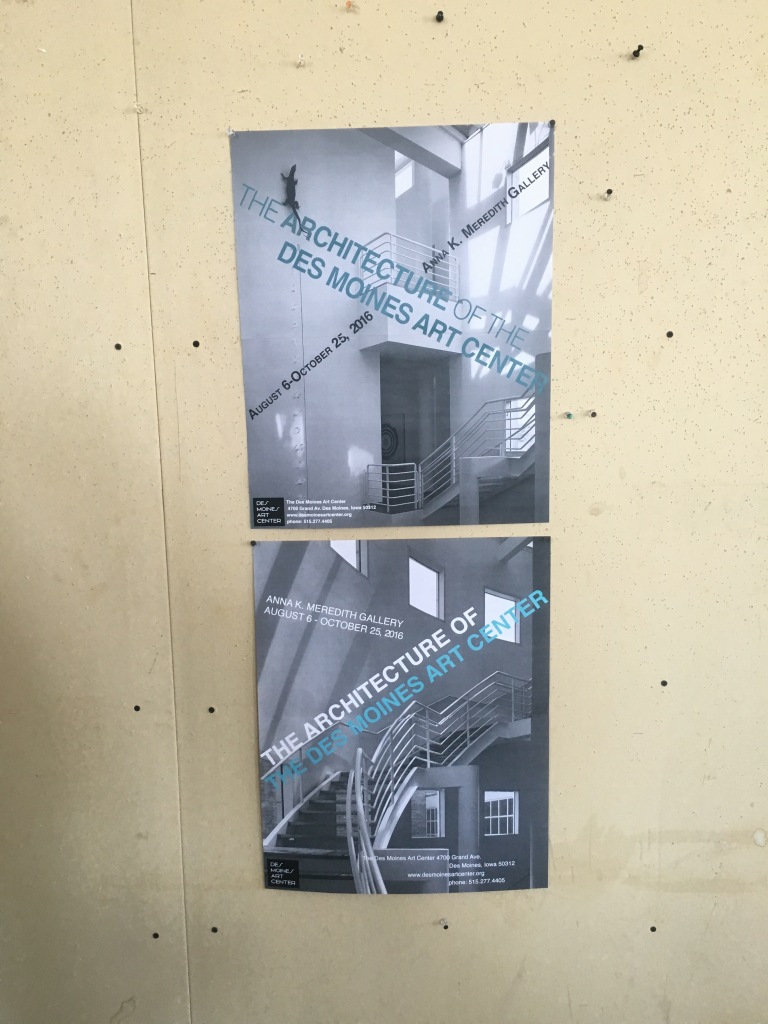
These were the two compositions that I chose for critique. During critique the suggestions that I was given for the top poster was to make the color more saturated and to make the other type slightly smaller. There was also the suggestion to play with the kerning of the words with the dates and the gallery since the small caps function is more of a default and does not always space the letters correctly. There was also the suggestion to move the bottom left hand information over towards the middle more.
For the second poster the suggestion was to play around with the color of the blue font to make it more readable in general. The other suggestion was to make the informative font smaller and less spaced out .